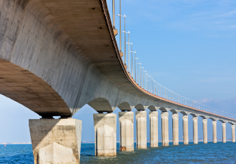
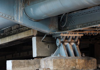
Guidelines for Aesthetic Bridge Design
Table of Contents
1. The Principles of Structural Design
2. Aesthetic Bridge Design References and General Guidelines
3. Superstructure Guidelines
4. Substructure Guidelines
5. Other Aspects
1. The Principles of Structural Design
Every Civil Engineer dedicated to structural design remembers the principles they are compelled to serve when designing a structure for public use: safety, serviceability, and aesthetics. From those three, the academic programs in Civil Engineering are focused on the first two, and sometimes they leave no room for the third principle. But this is not only a matter of the focus of the academic programs but also the importance that is given only for the first two in most cases. For example, it is difficult to find a bidding process for a bridge design that considers the aesthetics as they already do with the economy of the project.
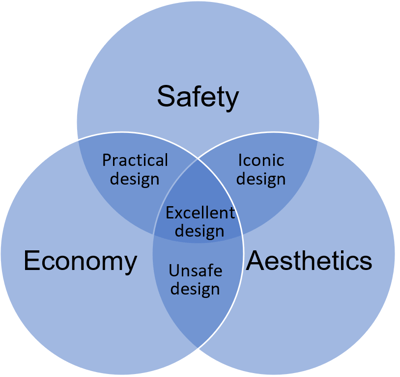
Let me ask you something. When you look around in your city, what is the structure that stands out in the landscape? Is this structure an icon for your city or a structure that attracts attention from the public? If you can detect such a structure in your area, it will most likely have a beautiful design with an excellent architectural design. This makes us think about the importance of the aesthetics of the civil structures.
Bridges are structures of particular importance for every city or human settlement; hence, they are more susceptible to aesthetic design, but those projects don’t always involve an architect. In fact, the architectural design of most bridges is performed by the structural designer. This fact is a wake-up call for those designers to raise the importance of the aesthetic component of projects, especially for bridges.
There is a saying that says, “there is no accounting for tastes,” and it is indeed challenging to please everyone’s tastes and more in terms of aesthetics. There is no magic formula for an aesthetic bridge design, and a design can have its admirers and detractors. Still, some concepts are of general acceptance and can definitively maximize the first group of people.
2. Aesthetic Bridge Design References and General Guidelines
There are several references in this matter, and they are not all new. From the german engineer Fritz Leonhardt in 1968 to design guides from Departments of Transportation in the USA (1995 and 2010) and Australia in 2019, there is a good compilation of guidelines for the aesthetic design of bridges.
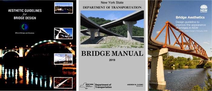 Figure 2. Guidelines for various Departments of Transportation: Minnesota (left), USA; New York (center), USA; and New South Wales (right), Australia.
It is important to highlight that these guidelines only focus on aesthetics. In contrast, some of the guidelines include slenderness ratios and dimension ratios, but they should not be confused with stability or minimum strength requirements.
2.1 Context and Location
Bridges need to be designed according to the landform and surroundings, such as the structures located nearby and their architecture. To obtain good insight, communities should be consulted as they are the main public using the bridges.
For example, the entrance to a castle, like the one shown in figure 3, is a good match of a bridge considering the surrounding architecture:
 Figure 3. Sant Angelo Castle and Bridge in sunset time, Rome, Italy.
2.2 Cost
If the only principles of structural design were safety and economy, then the cheapest bridge would be the most appropriate. However, this is not always the most cost-effective solution because variables like maintenance, comfort, and durability are also important and can point in other directions regarding the right bridge design.
There is also a strategic asset of governments in the structure's aesthetic that can boost tourism. For example, the Golden Gate Bridge in San Francisco (USA) is an iconic structure and is always used as a tourism selling point. This certainly doesn't mean that every bridge design should tend to create iconic structures. Still, balancing the structure's importance, magnitude, and aesthetics will result in the right amount of effort dedicated to the architectural design.

3. Superstructure Guidelines
The superstructure is the part of the bridge that has a more "viewable" area, so more attention to the details can lead to a more pleasant design.
3.1 Main Beam Slenderness
One key aspect of an aesthetic design is that it should convey the idea of a safe design. A very slender structure will not appear safe in the eye of the public. The design should consider an adequate visible slenderness ratio.
The slenderness ratio depends on the type of superstructure, but it ranges from 10 to 40 for most cases (NYSDOT BM):
- Steel trusses: average of 10.
- Steel girders: 10 to 30, with an average of 25.
- Concrete girders: 20 to 30, for short span bridges.
- Rigid concrete frames: average of 40.
The main idea is to give a safe look to the bridge, but not in excess. For example, the bridge in the right gives the impression of a stable and resistant bridge compared to the one on the left:

3.2 Cross-Sections Proportions
An aesthetic bridge design is concerned with the relationship between the dimensions of the cross-section. A well-proportioned cross-section reflects elegance, symmetry, and sound engineering. The following diagram from the NSW guidelines shows the proportions proposed by the Cardiff University School of Engineering:

3.3 Symmetry
There is a general preference for symmetric designs which should be applied to every part of the bridge:
- Constant or symmetric girder transverse spacing.
- Equal overhang widths.
- Symmetric metal railing and public lights arrangements.
For example, this bridge in Turkey looks incomplete because of the difference of the arches in each span, like if there should be a third arch of the same dimension at the left like the one that is actually built in the right.
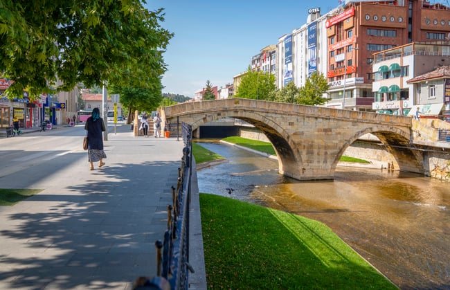 Figure 7. Multi-arched stone bridge in the city center (Kastamonu, Turkey).
3.4 Parapet
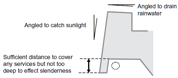
The parapet is the part of the deck of a bridge closer to the viewer's sight. This element can address different aspects that impact aesthetics: light, drainage, and cover.
The most beautiful structure could remain anonymous if it does not get light. Bridges usually get this light from the sun, and a way to enhance this is to angle the lateral face of the deck towards the sun just a little. This design catches more sunlight and for more minutes per day than a vertical or inverted face.
Another concern about concrete in bridges is that concrete is a material that can decolor and accumulate organic material when the water stays on the surface for long periods of time. This process is accelerated depending on the quality of the water. Still, to maintain the concrete's good appearance, the design should provide a way for the water to drain correctly.
When a bridge is constructed, the main structure is usually employed to attach and support secondary elements like cables, pipes, etc. Those elements can have a negative impact on the bridge's aesthetic, and a parapet can be used to cover them.
3.5 Girder Elevation
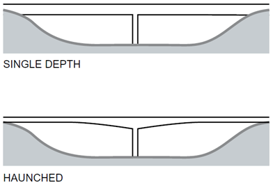
For small and medium span length bridges, main beams are usually of constant depth. This favors the economy in the construction as it requires less detailing, and formwork is simpler. However, haunched (variable depth) girders optimize the material usage and concentrate the material where more strength is needed. This concept is frequently used in medium to long-span length bridges, and it is responsive to the forces experimented in each part of the bridge and adds elegance to the design. Haunched girders are cost-effective in spans over 60 meters (MnDOT guidelines).
Detailed proportions of the haunch are given in the NYSDOT BM:
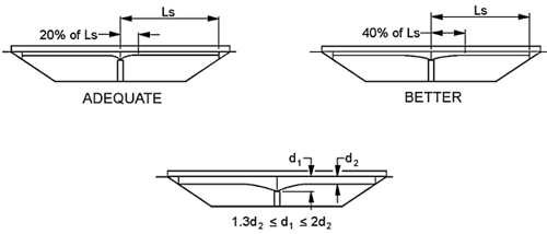
Haunched girders also need special consideration of the dimensions in the piers or intermediate supports, as they will be placed in the deeper part of the beam. The size of the pier should be adequate, so it doesn't look weak.
3.6 Incidence Angle of the Sunlight
One strategy to enhance the visual slenderness of the superstructure is to play with the incidence angle of the sunlight. A bridge without an overhang and a concrete barrier, for example, is more likely to look sturdy than slender. A proper deck overhang (2/3 of the girder depth, according to most guidelines) helps by hiding the girder and virtually diminishes the dimension of the element.
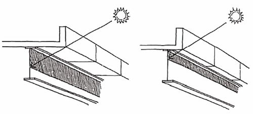
If the girder has vertical webs, the shadow is stronger than with inclined webs. Inclined webs catch less light and hence make the girder look thinner.

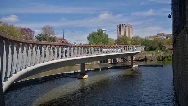
Another way to enhance visual slenderness is using curved parapets that catch the sunlight in a thin line. For example, for this bridge, a round deck border is used:
4. Substructure Guidelines
Most designed bridges have narrow piers (or none for the case of simple span bridges). These types of substructures are not too flexible for implementing aesthetic design, but there can be some basic guidelines even for those substructures.
4.1 Pier Cap or Headstocks
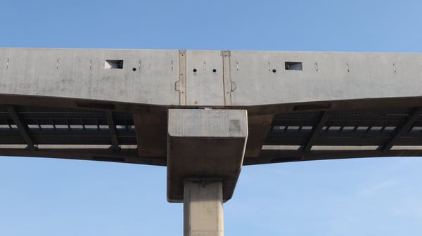 Figure 14. Prominent pier cap in a haunched beam.
The pier cap transfers the reactions of multiple girders to the pier. This element often stands out visually in the elevation of the bridge, so there are some recommendations to handle the aesthetical issue:
- If possible, they should be integrated with the pier such that the elevation only shows the pier.
- If possible, the cap beam should not cross and be extended from the outer girders' external faces.
- When the above recommendations cannot be implemented, a beveled end can be used. The beveled end guidelines for the most aesthetical design is shown below:
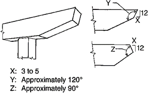 Figure 15. Influence of inclined webs or faces in the slenderness perception (figure 4-18 MnDOT guidelines).
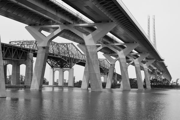
One great example of stylization of the pier cap beam with the adoption of the previous recommendations and beyond is the Samuel De Champlain Bridge:
4.2 Longitudinal Pier Spacing
The general guideline here is to maintain symmetry by using equal longitudinal spacings. However, this does not guarantee a well-proportioned superstructure and substructure. Take the Windang bridge in NSW, for example, where the number of piles in the piers and its close location gives the appearance of a thick and complex substructure:

Where the foundation conditions are very steep, the ideal condition is to maintain the angle between the upper part of one pier and the bottom of the other. However, this is not an economical approach as the spans would be all different, but when there is a good number of spans, a balanced approach is to use a set of span lengths and distribute them in the bridge so that various spans use the same lengths.
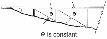 Figure 18. Spans proportional to the height of piers (figure 4-8 MnDOT guidelines).
4.3 Pier Cross-Elevation
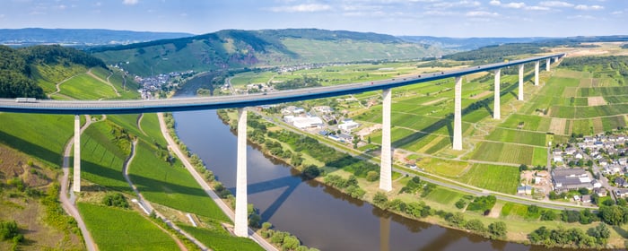
Old designs of piers can be replaced with more aesthetic ones. Here, the frame-type of the pier is replaced for the same type of pier with a modern outlook while following adequate proportion guidelines for each part:
 Figure 20. Piers with varying height (figure 5-4 MnDOT guidelines).
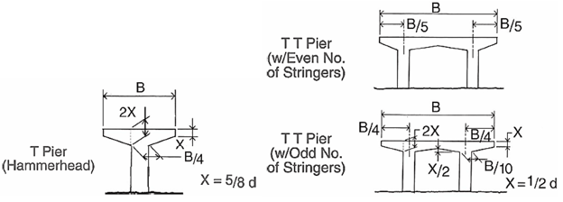 Figure 21. Guidelines for hammerhead piers (figure 5-28 to 5-30 MnDOT guidelines).
Other piers have recommendations regarding the variation of a section with height, which can be different for the cross and longitudinal elevation.
4.4 Pier Longitudinal Elevation
Piers dimensions should be thin enough to be cost-effective and safe but not too thin that they don't provide the sensation of safety even when guaranteed on paper.
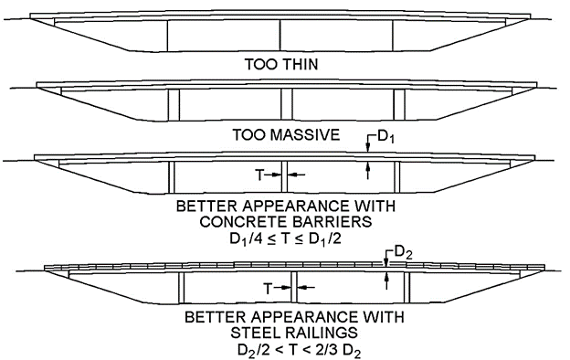
Figure 22. Pier thicknesses in the bridge elevation (figure 23.11 NYSDOT BM).
4.5 Abutments
For single-span bridges, the visual slenderness ratio and the size of the abutments should meet at a balanced point where the structure looks safe enough without blocking the landscape or being too dominant. In the following figure, the one in the right is a better option than the left option of bridge:

5. Other Aspects
Other design recommendations, like coloring and lighting, are given in detail in the referenced documents.
References:
-
Centre for Urban Design of New South Wales (NSW) (2019). Bridge Aesthetics: Design guideline to improve the appearance of bridges in NSW. https://roads-waterways.transport.nsw.gov.au/business-industry/partners-suppliers/documents/centre-for-urban-design/bridge-aesthetics-guidelines.pdf
-
New York Department of Transportation (NYSDOT) (2008). Bridge Design Manual, Chapter 23: Aesthetics. https://www.dot.ny.gov/divisions/engineering/structures/repository/manuals/brman-usc/Section_23_US_2010.pdf
-
Minnesota Departments of Transportation (MnDOT) (1995). Aesthetic Guidelines for Bridge Design. https://www.dot.state.mn.us/bridge/pdf/aestheticguidelinesforbridgedesign.pdf
-
Fritz Leonhardt (1968). PCI journal. Aesthetics of bridge design. https://www.pci.org/PCI_Docs/Design_Resources/Guides_and_manuals/references/bridge_design_manual/JL-68-February_Aesthetics_of_Bridge_Design.pdf
 Get Started midas Civil
 Featured blog of this week


